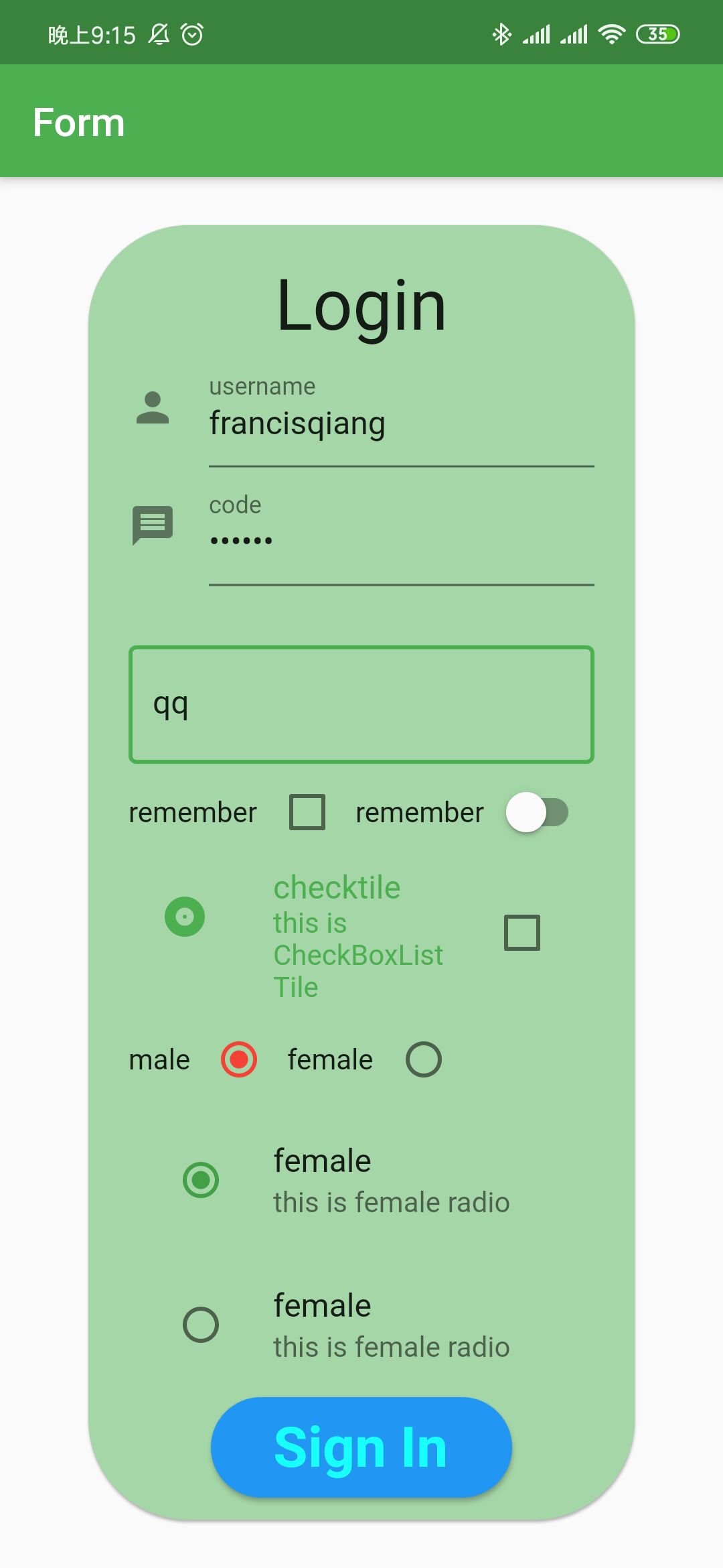
Flutter组件——表单组件

TextField

在Flutter中TextField是最重要的一个表单组件,它是定义输入框,密码框以及textarea。

其中有几个重要的属性

  • maxLines

    最大行数接受一个int,当这个设置为1时,就是我们平常的文本框了,你可以把它设置成更大,然后让它变成一个textarea。

  • onChanged

    接受一个函数,函数中传入一个当前文本框值的参数,通过这个我们可以在文本框值改变的时候设置我们的值。

  • decoration

    设置文本框的样式,接受一个InputDecoration对象,这个对象中的属性用来设置当前文本框的样式属性,比如说hintText类似于html的placeholder,labelText设置标签的文本,labelStyle设置标签文本文字样式(跟TextStyle用法一样), border设置文本框边框,我们可以传入一个OutlineInputBorder等。

  • obscureText

    是否设置为密码框,默认为false,设置为true的时候就是密码框。

  • controller

    接受一个TextEditController,我们可以在组件初始化的时候创建一个关于当前文本框的TextEditController,然后我们通过addListener函数来监听当前文本框的变化,它的作用比onChanged还要大。

1
2
3
4
5
6
7
8
9
10
11
12
13
14
15
16
17
18
19
20
21
22
23
24
25
26
27
28
29
30
31
32
33
34
35
36
37
38
39
40
41
42
43
44
45
46
47
48
49
50
51
52
53
54
55
56
const TextField({
Key key,
this.controller,
this.focusNode,
this.decoration = const InputDecoration(),
TextInputType keyboardType,
this.textInputAction,
this.textCapitalization = TextCapitalization.none,
this.style,
this.strutStyle,
this.textAlign = TextAlign.start,
this.textDirection,
this.autofocus = false,
this.obscureText = false,
this.autocorrect = true,
this.maxLines = 1,
this.minLines,
this.expands = false,
this.maxLength,
this.maxLengthEnforced = true,
this.onChanged,
this.onEditingComplete,
this.onSubmitted,
this.inputFormatters,
this.enabled,
this.cursorWidth = 2.0,
this.cursorRadius,
this.cursorColor,
this.keyboardAppearance,
this.scrollPadding = const EdgeInsets.all(20.0),
this.dragStartBehavior = DragStartBehavior.start,
this.enableInteractiveSelection,
this.onTap,
this.buildCounter,
this.scrollPhysics,
}) : assert(textAlign != null),
assert(autofocus != null),
assert(obscureText != null),
assert(autocorrect != null),
assert(maxLengthEnforced != null),
assert(scrollPadding != null),
assert(dragStartBehavior != null),
assert(maxLines == null || maxLines > 0),
assert(minLines == null || minLines > 0),
assert(
(maxLines == null) || (minLines == null) || (maxLines >= minLines),
'minLines can\'t be greater than maxLines',
),
assert(expands != null),
assert(
!expands || (maxLines == null && minLines == null),
'minLines and maxLines must be null when expands is true.',
),
assert(maxLength == null || maxLength == TextField.noMaxLength || maxLength > 0),
keyboardType = keyboardType ?? (maxLines == 1 ? TextInputType.text : TextInputType.multiline),
super(key: key);

Checkbox,CheckboxListTile多选框组件

Checkbox常见属性

  • value

    当前多选框的值,设置成true或者false。

  • onChanged

    在多选框的值被改变的时候调用的函数

  • activeColor

    选中的背景颜色

  • checkColor

    选中的√的颜色

CheckboxListTile

checkboxListTile是类似于ListTile的多选框,其中也可以像ListTile中定义title,subtitle等。

  • value

    当前多选框的值,设置成true或者false

  • onChanged

    改变的时候接受的函数

  • title, subtitle

    标题

  • secondary

    在前面设置图片或者图片

  • selected

    选中的时候是否文字颜色跟着改变

Radio,RadioListTile

Radio和checkbox差不多,主要就是一个groupValue。

radio中有一个value是定义当前单选按钮的value,还有一个是groupValue是定义当前单选按钮对应的组的值。其他属性和checkbox差不多,同理RadioListTile也和checkboxListTile也差不多。

Demo代码示例

demo样式

1
2
3
4
5
6
7
8
9
10
11
12
13
14
15
16
17
18
19
20
21
22
23
24
25
26
27
28
29
30
31
32
33
34
35
36
37
38
39
40
41
42
43
44
45
46
47
48
49
50
51
52
53
54
55
56
57
58
59
60
61
62
63
64
65
66
67
68
69
70
71
72
73
74
75
76
77
78
79
80
81
82
83
84
85
86
87
88
89
90
91
92
93
94
95
96
97
98
99
100
101
102
103
104
105
106
107
108
109
110
111
112
113
114
115
116
117
118
119
120
121
122
123
124
125
126
127
128
129
130
131
132
133
134
135
136
137
138
139
140
141
142
143
144
145
146
147
148
149
150
151
152
153
154
155
156
157
158
159
160
161
162
163
164
165
166
167
168
169
170
171
172
173
174
175
176
177
178
179
180
181
182
183
184
185
186
187
188
189
190
191
192
193
194
195
196
197
198
199
200
201
202
203
class MyApp extends StatelessWidget {
@override
Widget build(BuildContext context) {
return MaterialApp(
title: 'Form App',
debugShowCheckedModeBanner: false,
theme: ThemeData(primarySwatch: Colors.green),
home: Scaffold(
resizeToAvoidBottomPadding: false,
appBar: AppBar(
title: Text('Form'),
),
body: MyForm(),
),
);
}
}

class MyForm extends StatefulWidget {
@override
_MyFormState createState() => _MyFormState();
}

class _MyFormState extends State<MyForm> {
TextEditingController _usernameController = TextEditingController();
TextEditingController _passwordController = TextEditingController();
TextEditingController _informationController = TextEditingController();

bool _checkBool = false;

bool _switchBool = false;

int _groupValue = 0;

@override
void initState() {
super.initState();
_usernameController.addListener(() {
print(_usernameController.text);
});
_passwordController.addListener(() {
print(_usernameController.text);
});
_informationController.addListener(() {
print(_usernameController.text);
});
}

@override
Widget build(BuildContext context) {
return Center(
child: Container(
margin:
EdgeInsets.only(left: 20.0, right: 20.0),
padding: EdgeInsets.all(20.0),
height: 750.0,
width: 550.0,
child: Card(
color: Colors.green[200],
shape: RoundedRectangleBorder(
borderRadius: BorderRadius.circular(50.0),
),
child: Padding(
padding: EdgeInsets.only(left: 20.0, right: 20.0),
child: Column(
mainAxisAlignment: MainAxisAlignment.start,
children: <Widget>[
SizedBox(
height: 20.0,
),
Container(
child: Text('Login',
textScaleFactor: 2.5, textAlign: TextAlign.center),
),
TextField(
controller: this._usernameController,
maxLines: 1,
onChanged: (username) {
print(username);
},
decoration: InputDecoration(
hintText: 'username',
labelText: 'username',
icon: Icon(Icons.person)),
),
TextField(
controller: this._passwordController,
maxLines: 1,
onChanged: (password) => debugPrint(password),
decoration: InputDecoration(
hintText: 'code',
labelText: 'code',
icon: Icon(Icons.message),
),
obscureText: true,
),
SizedBox(
height: 30.0,
),
TextField(
controller: this._informationController,
maxLines: 1,
onChanged: (content) {
debugPrint(content);
},
decoration: InputDecoration(
hintText: 'please input your information here',
border: OutlineInputBorder(
borderSide: BorderSide(
color: Colors.purple,
width: 1.5,
style: BorderStyle.solid))),
),
Row(
children: <Widget>[
Text('remember'),
Checkbox(value: this._checkBool, onChanged: (value) {
setState(() {
this._checkBool = value;
print(value);
});
}, checkColor: Colors.indigo,),
Text('remember'),
Expanded(
child: Switch(value: this._switchBool, onChanged: (value){
setState(() {
this._switchBool = value;
});
},activeColor: Colors.indigo,),
),
],
),
CheckboxListTile(
title: Text('checktile'),
subtitle: Text('this is CheckBoxListTile'),
secondary: Icon(Icons.album),
value: this._checkBool,
onChanged: ((value){
setState(() {
this._checkBool = value;
});
}),
selected: true,
),
Row(
children: <Widget>[
Text('male'),
Radio(value: 0, groupValue: this._groupValue, onChanged: (value){
setState(() {
this._groupValue = value;
});
}, activeColor: Colors.red,),
Text('female'),
Radio(value: 1, groupValue: this._groupValue, onChanged: (value){
setState(() {
this._groupValue = value;
});
})
],
),
RadioListTile(value: 0, groupValue: this._groupValue, onChanged: (value){
setState(() {
this._groupValue = value;
});
}, title: Text('female'), subtitle: Text('this is female radio')),
RadioListTile(value: 1, groupValue: this._groupValue, onChanged: (value){
setState(() {
this._groupValue = value;
});
}, title: Text('female'), subtitle: Text('this is female radio'),),
Container(
height: 50.0,
width: 150.0,
child: RaisedButton(
shape: RoundedRectangleBorder(
borderRadius: BorderRadius.circular(50.0),
),
color: Colors.blue,
onPressed: () {
if (_usernameController.text == 'francisqiang' &&
_passwordController.text == '123456' &&
_informationController.text != '') {
print('success');
} else {
print('fail');
}
},
child: Text(
'Sign In',
textScaleFactor: 2.0,
style: TextStyle(
color: Colors.cyanAccent,
fontWeight: FontWeight.bold),
),
),
)
],
),
)),
),
);
}
}
-------------本文结束感谢阅读-------------